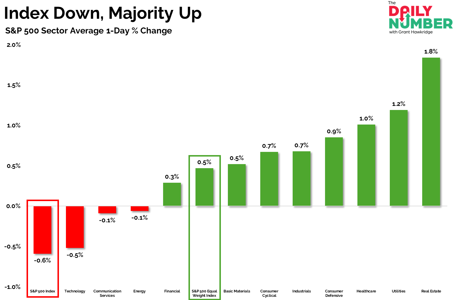
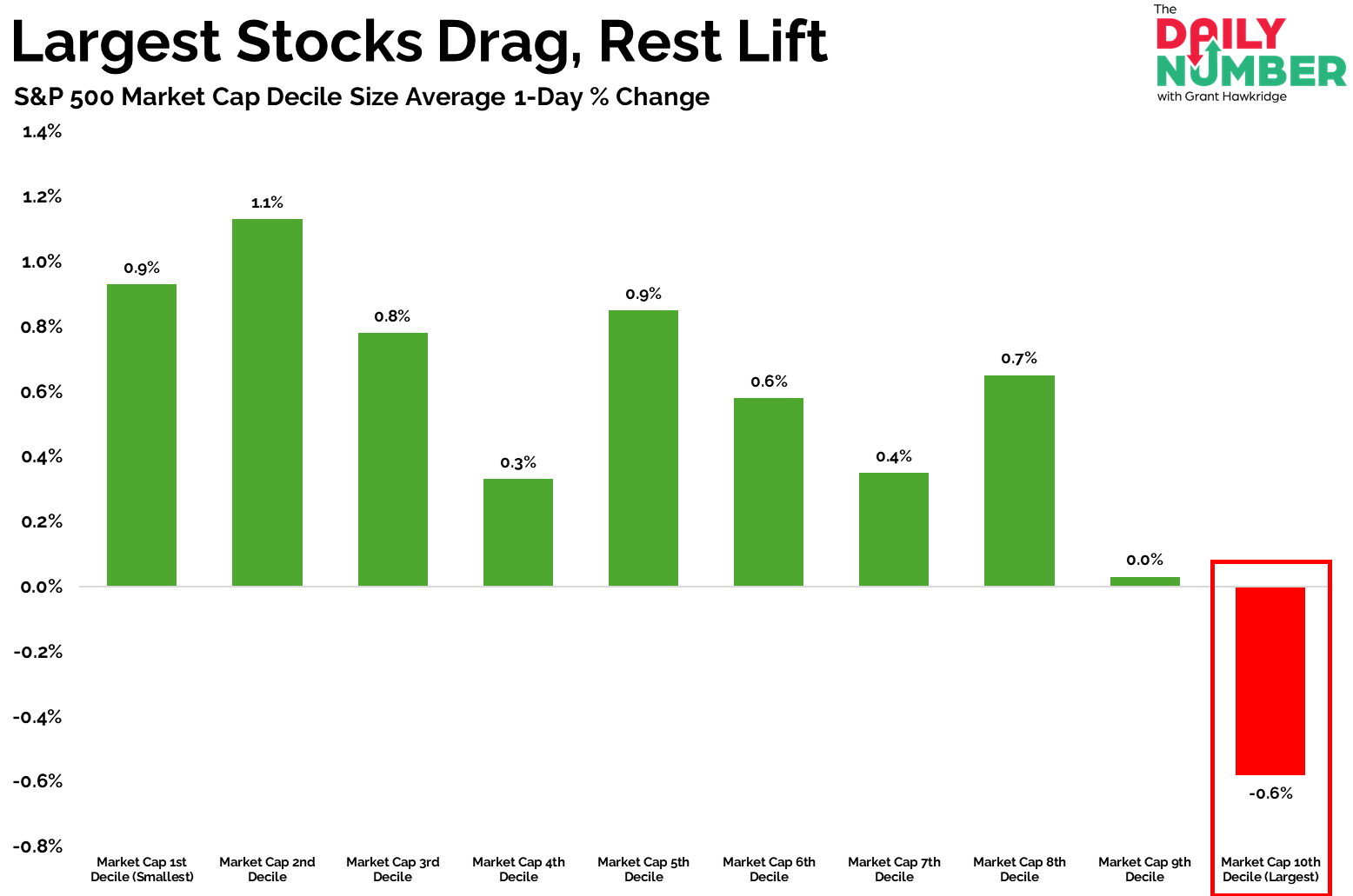
Grant Hawkridge Index Red, Market Green🚦 August 19, 2025 Today's number is... -0.6%The S&P 500 Index fell by -0.6% yesterday — but under the surface, most stocks finished higher.Here are the charts: Let's break down what the charts shows:The first chart plots the average 1-day % change across S&P 500 sectors.The red bars show sectors that are negative, while the green bars show those that are positive.The second chart shows the S&P 500 split by market-cap deciles, average 1-day % change.The red bars show market-cap decile size that are negative, while the green bars show those that are positive.The Takeaway: The tape told two very different stories yesterday.The headline index closed –0.6%, but the equal-weight S&P 500 finished +0.5%, with 8 of 11 sectors green.Real Estate, Utilities, and Healthcare names led, while Technology names were the main drag.The decile breakdown sharpens it further.Nine of ten buckets rose.Only the 10th decile — the largest companies in the S&P 500 — fell, down –0.6%.A negative print at the index level can look like risk-off, but when the bulk of the S&P 500 is rising, it’s a different message.Selling was narrow, not broad.Breadth expanded, participation was healthy, and the average stock moved higher.That’s rotation — not broad selling.The market is healthier than the headline suggests.So the question is — are you trading the index, or the market?Let me know!Grant Hawkridge | Chief Aussie Operator, All Star ChartsJeff Macke is unveiling his brand-new Macke Consumer Universe this Wednesday at 2pm ET.He’ll also break down his “Super Bowl of earnings” — Walmart, Target, Home Depot, and more.Wednesday, August 20, 2pm ET.Click here to register.If you find my content valuable, I would greatly appreciate it if you could share it with your friends, family, and colleagues. Your help in spreading the word is invaluable in supporting our work. Thank you to all of you who share!Sign Up Free For The Daily Number Filed Under: Grant Share Article