The average S&P 500 stock is up 6.0% Year-To-Date, while the index itself is only up 0.6%.
Here’s the chart:
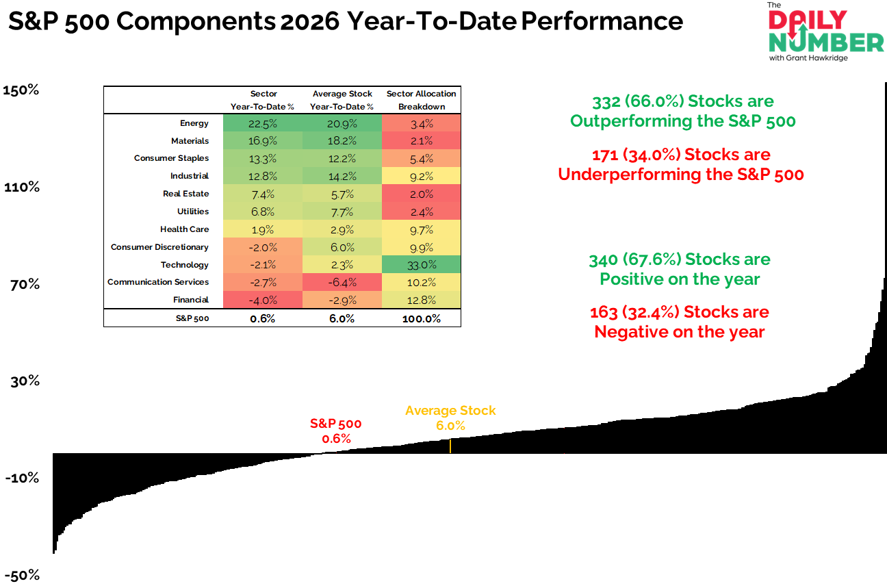
Let's break down what the chart shows:
The chart displays a horizontal distribution curve that orders all S&P 500 components from worst to best Year-To-Date performance.
The table compares sector performance, average stock performance within each sector, and sector weight in the index.
On the right side, summary statistics show the percentage of stocks outperforming/underperforming the index and the percentage positive/negative for the year.
The Takeaway: The average S&P 500 stock is up 6.0% this year. The index is up 0.6%. Most stocks are working. The index is not.
If you are just trading the index, you are missing what most stocks are actually doing.
Two-thirds of stocks are positive for the year.
Two-thirds are outperforming the index.
That is broad participation across the board. When you see that level of participation, you are not looking at a market under too much stress. You are looking at a market where bulls are active beyond the largest names.
The weakness comes from weight. Technology accounts for 33.0% of the index and is down 2.1%. Financials carry 12.8% and are down 4.0%. Communication Services are 10.2% and down 2.7%. Add those together and more than half the index is stuck in sectors that are negative year-to-date. That keeps the headline pinned down even as most stocks grind higher.
Now look at where the strength sits. Energy is up 22.5%. Materials are up 16.9%. Together they represent just 5.5% of the index. They are doing real work under the surface, but they do not have the size to move a cap-weight benchmark dominated by mega caps.
Mega caps are dragging their feet. The rest of the list is moving. If the big names turn, the index moves fast. If they do not, does the average stock keep grinding higher, or does it roll over to match them?