The S&P 500 and the Dow Jones closed below their 10-month moving averages at the end of March.
Here’s the chart:
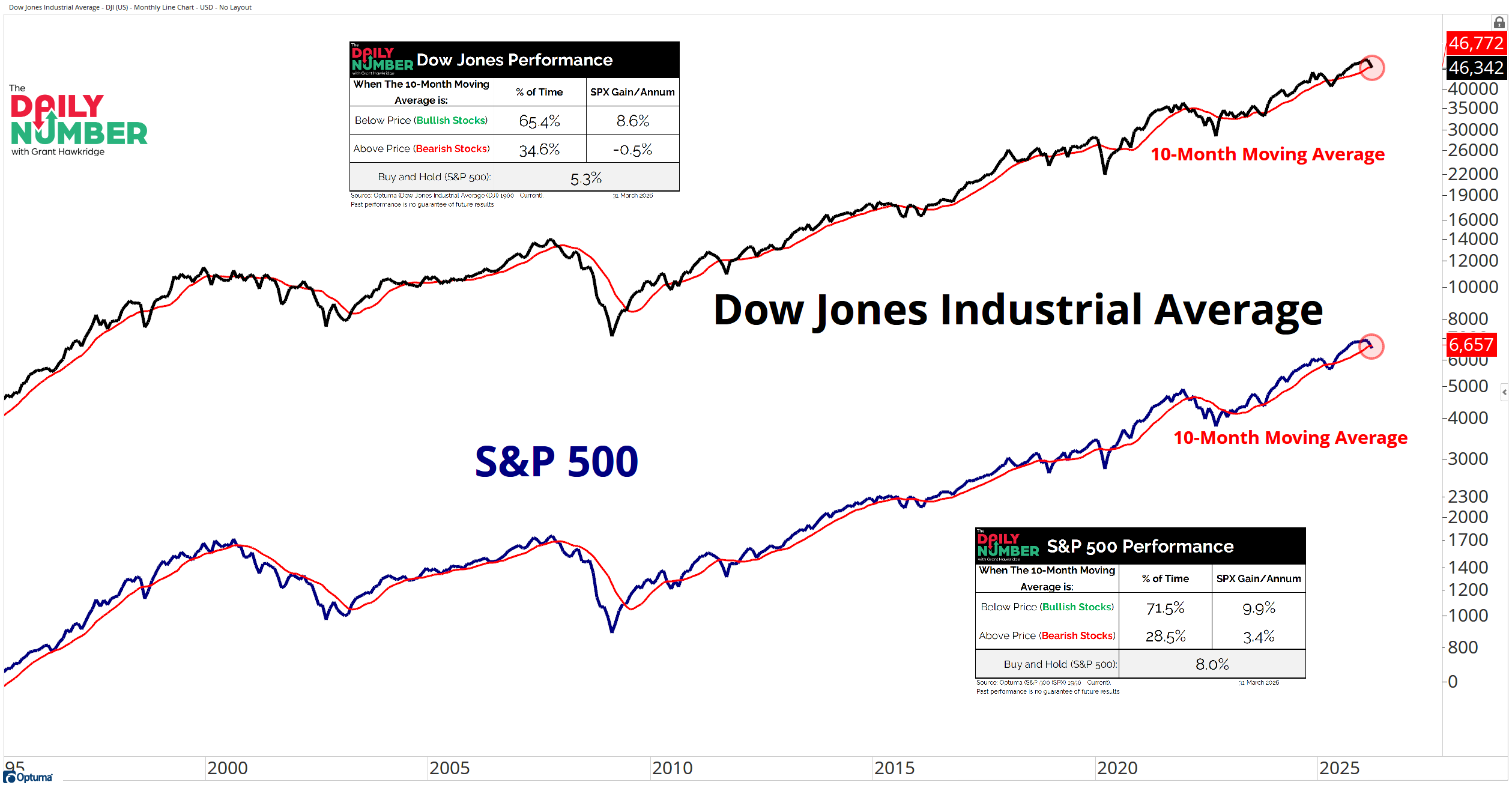
Let's break down what the chart shows:
The chart displays the Dow Jones Industrial Average as a black line with a red 10-month moving average.
A second chart displays the S&P 500 as a blue line with a red 10-month moving average.
Small tables appear beside each index summarizing historical performance when price trades above or below the 10-month moving average.
The tables list the percentage of time each condition occurs and the corresponding annualized return.
The Takeaway: The primary trend just flipped.
The S&P 500, Dow Jones, and Nasdaq 100 all closed below their 10-month moving averages at the end of March. This moving average line sits at the center of one of the oldest trend systems traders use.
The rules for this system are quite simple. Above the 10-month average you own stocks. Below it you reduce risk, hedge, or step aside.
The long-term numbers explain why traders watch this line.
The S&P 500 trades above the 10-month moving average 71.5% of the time. Bull markets dominate the long-term record. But the market spends the other 28.5% of the time below the trend. Those periods hold most of the damage.
Returns change when the trend breaks.
The S&P 500 delivers 9.9% annual returns when price stays above the average. Returns fall to 3.4% when price sits below it. The Dow shows an even sharper split. Returns average 8.6% above the trend and drop to -0.5% below it.
Multiple indices breaking the same level raises the stakes. The Dow, S&P 500, and Nasdaq 100 all closed below the 10-month trend. That shift pushes the market from the higher-return regime into the lower-return one.
But a break of this trend does not guarantee a bear market.
Markets sometimes reclaim the trend quickly and move back into the bullish regime.
So, do bulls reclaim the 10-month moving average line… or does the market start behaving like the 28.5% of history when it trades below it?
Grant Hawkridge | Chief Aussie Operator, All Star Charts
Jason Perz just went live and walked through the commodity rotation pattern that's played out every decade for 50 years, and where it's pointing right now. The replay is available now.