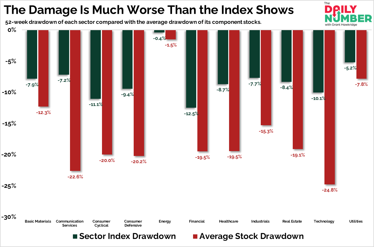
The average Technology stock is down -24.8% from its 52-week high, already deep in bear market territory.
Look across the chart and the same damage is showing up everywhere:
Let's break down what the chart shows:
The chart displays eleven sectors along the horizontal axis.
Each sector contains two vertical bars.
The green bars represent the 52-week drawdown of the sector index.
The red bars represent the average 52-week drawdown of the individual stocks within that sector.
The Takeaway: The average stock is falling much more than the sector indexes. This gap appears in every sector on this chart.
Most sector indexes sit between about –7% and –12%. The average stock in those same sectors sits between about –15% and –25%. The indices are correcting. The average stock already has.
Every red bar drops further than its green counterpart. Most stocks inside those sectors have fallen harder than the sector index itself.
Many sectors already have average stocks in bear market territory. Communication Services sits at –22.6%. Consumer Cyclical –20% and Technology leads the damage at –24.8%.
Technology shows the clearest example of the gap. The sector index is down –10.1%. The average stock inside the sector is down –24.8%.
Traders who focus only on sector ETFs or the S&P 500 see a normal pullback. The average stock has experienced something very different.
However, energy stands apart from the rest of the market. Stocks inside the sector are holding together while most other sectors break down. Energy is one of the few sectors where strength still runs across the entire group.
So do you trust the index, or the damage underneath it?