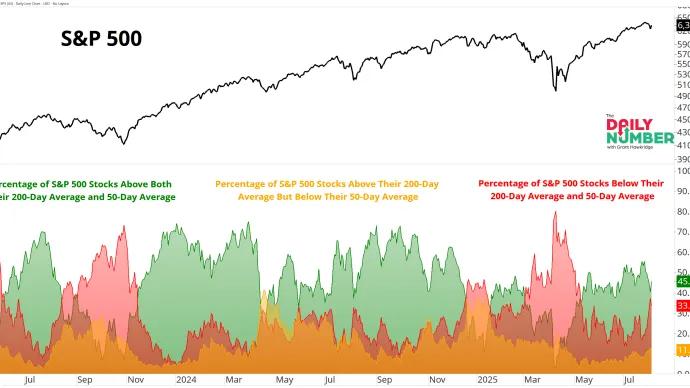
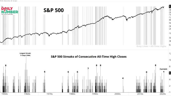
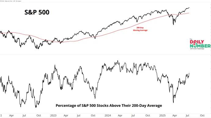
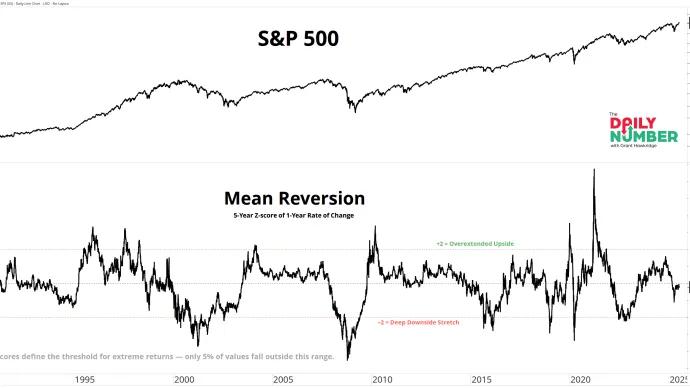
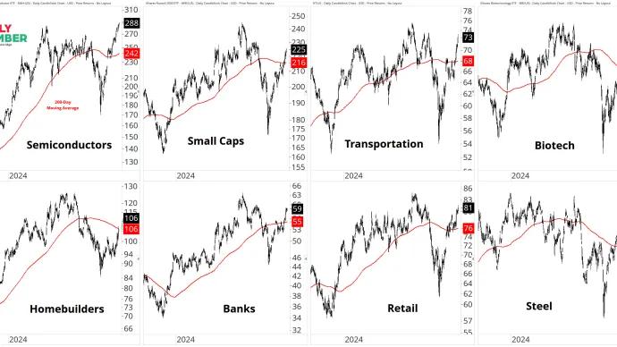
There have been 52 consecutive trading days the S&P 500 has closed above its 20-day moving average — just shy of the 53-day streak seen in early 2024 — and one of the most persistent...
The composite Z-score of three major sentiment surveys—AAII Bulls, Investors Intelligence Bulls, and the NAAIM Exposure Index—just hit 0.72. That’s the highest reading of 2025 and marks...
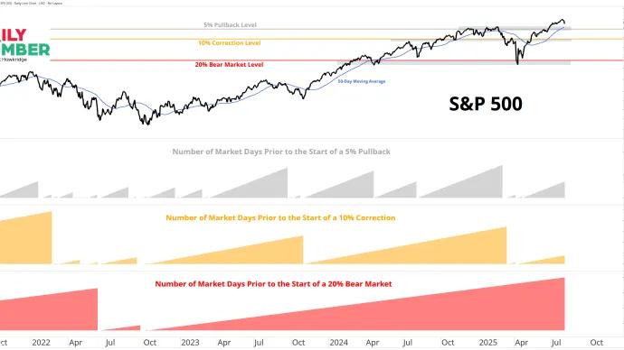
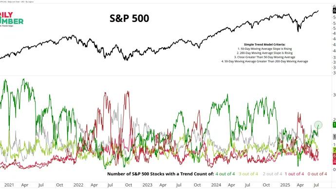
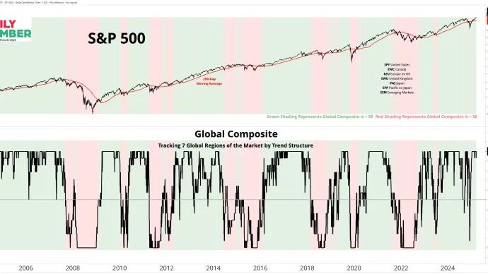
That’s how many green lights are flashing in this two-factor trend model built on two of the market’s oldest rules: don’t fight the tape, and don’t fight the Fed.
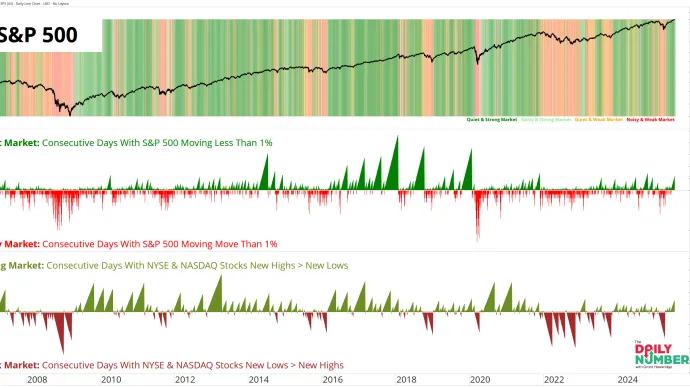
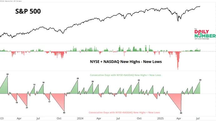
The NYSE Advance/Decline Diffusion Index crossed above 60 and has held for the past two weeks — this is the first overbought reading since October 2024.