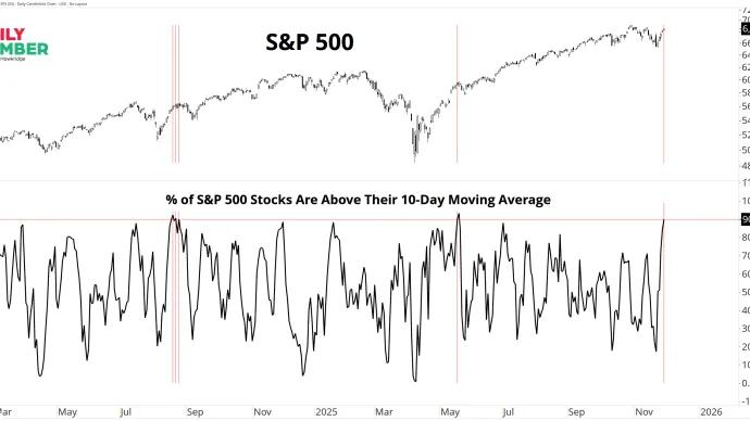
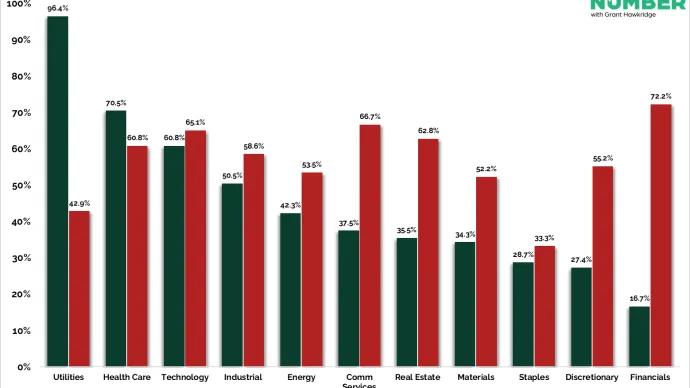
Short-term participation exploded on Friday, with 90.1% of S&P 500 stocks finishing above their 10-day moving average, our first 10-day breadth thrust since May.
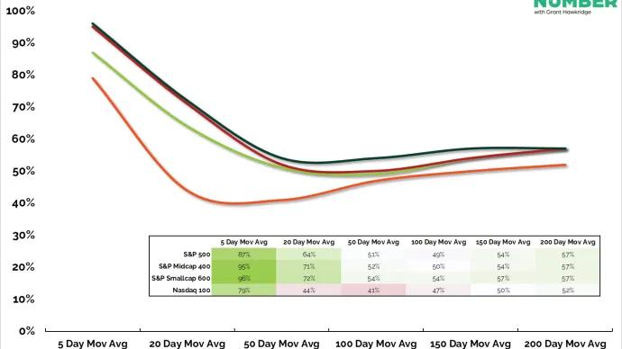
The 5-day moving average window just lit up across the market. Every major index now sits near the top of its short-term breadth curve after a sharp reset.
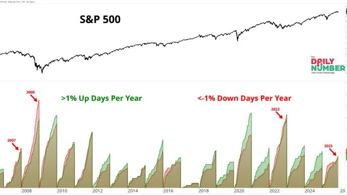
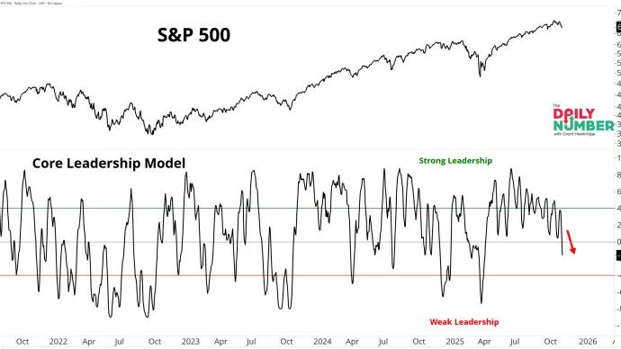
My Core Leadership Model, the composite that blends short, intermediate, and long-term breadth, has slipped back under zero and is moving toward the weak leadership zone.
When I started this note, I had one goal. Share one piece of market truth each day. No noise. No drama. Just data. Something useful traders could read in under two minutes and walk away sharper.
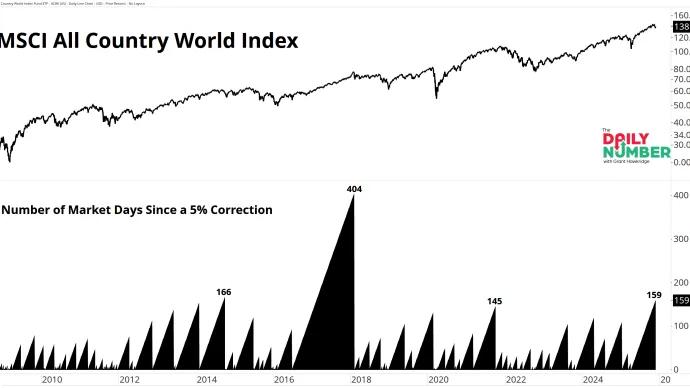
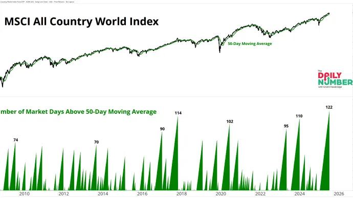
The MSCI All Country World Index has stayed above its 50-day moving average for 122 trading days. That’s the longest run of global strength in 15 years.