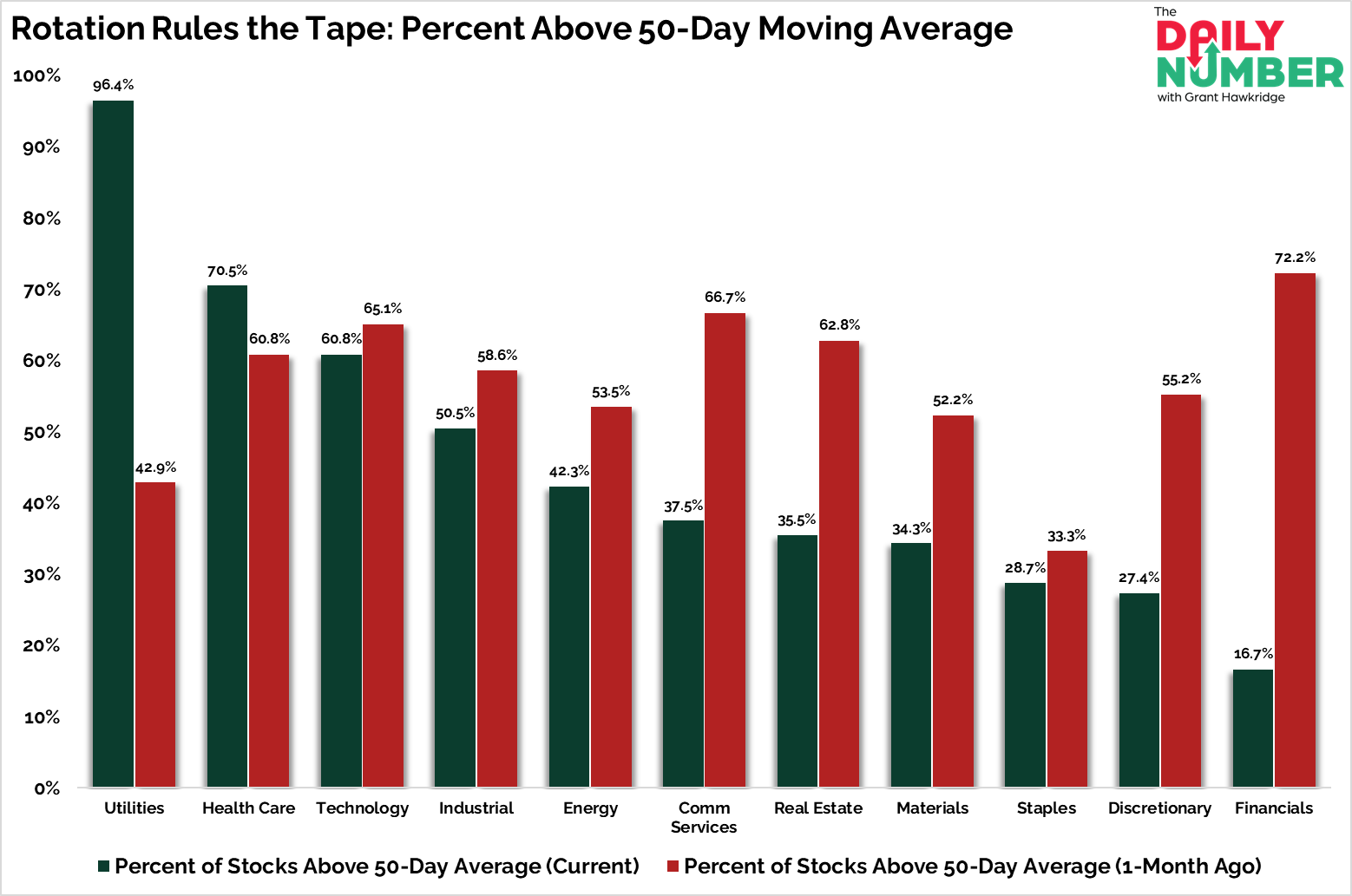
Utilities lead all sectors, with 96.4% of stocks above their 50-day average.
Here’s the chart:
Let's break down what the chart shows:
The chart tracks sector breadth using the percentage of stocks above their 50-day moving average, with green bars marking current readings and red bars showing levels from one month ago.
The Takeaway: Utilities lead the pack with 96.4% of stocks above their 50-day average, up from 42.9% a month ago. Health Care follows at 70.5%.
Both are classic defensive sectors, and both have strengthened sharply as capital rotates away from risk-on areas.
At the other end, Financials have collapsed to 16.7% from 72.2%.
The Discretionary sector has also weakened, confirming that cyclical groups are losing internal strength.
Technology and Industrials sit in the middle of the range, still holding more than half of their components in short-term uptrends.
Breadth has not vanished, it has shifted.
Traders are still participating, but they are moving toward lower vol areas that can hold up if markets pause.
When Utilities and Health Care dominate while Financials and Discretionary fade, it signals that risk appetite is cooling but not gone.
The trend is alive, but leadership is changing fast. The next move will tell us if this bull still has fuel or if it’s starting to fade.
If you find my content valuable, I would greatly appreciate it if you could share it with your friends, family, and colleagues. Your help in spreading the word is invaluable in supporting our work. Thank you to all of you who share!